May 6, 2025
This guide will help you identify if you're a Cool Summer and show you exactly how to build a wardrobe that works with your natural coloring—not against it.
Palette uses advanced AI techniques tailored for color analysis and photoshoots.

Color analysis is a powerful system used to determine which hues complement your natural complexion, eye color, and hair tone. For those who fall under the Cool Summer category, understanding this system can revolutionize the way you dress, apply makeup, and shop for clothing. This guide will help you identify if you're a Cool Summer and show you exactly how to build a wardrobe that works with your natural coloring—not against it.
What Is Color Analysis for Cool Summer?
In the color analysis framework, Cool Summer is one of the twelve subcategories under the broader "Summer" season. This type is defined by soft, cool, and muted features with an overall lighter appearance.
Key Traits of a Cool Summer
Feature | Typical Characteristics |
|---|---|
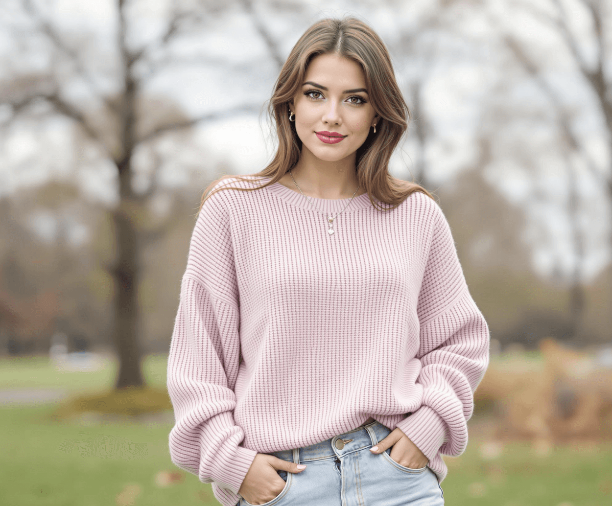
Skin Undertone | Cool pink, rose beige, or porcelain with blue undertones |
Hair Color | Ash blonde, ash brown, soft grayish tones |
Eye Color | Gray-blue, soft blue, hazel with cool undertones |
Contrast Level | Low to medium (no stark contrast between features) |
Dominant Traits | Cool, soft, and muted overall coloring |
Why Color Analysis Is Essential for Cool Summer
Using color analysis correctly helps you:
Avoid wearing colors that wash you out or add harsh contrast.
Enhance your natural radiance and minimize imperfections.
Build a capsule wardrobe that’s cohesive and flattering.
Simplify makeup choices and reduce decision fatigue when shopping.
Because Cool Summers tend to have delicate coloring, wearing shades that are too warm or intense can overpower the natural softness of your look. With color analysis, you’ll get a clear roadmap for choosing shades that harmonize beautifully with your skin, eyes, and hair.
The Cool Summer Color Palette
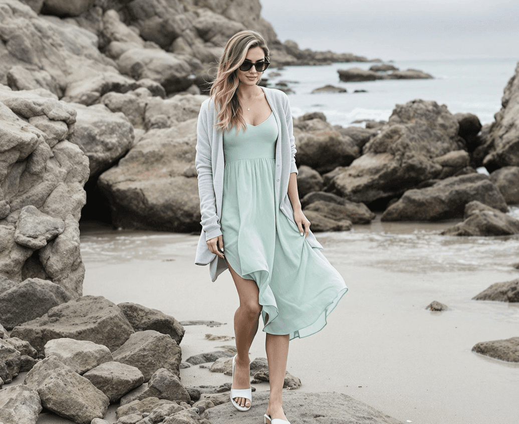
The Cool Summer palette features cool, soft, and medium-light colors. Think of colors you’d find on a cloudy beach day: soft lavender, slate blue, icy pinks, and misty greens. These hues maintain a gentle vibrancy that matches the subtle contrast of Cool Summer individuals.
Ideal Cool Summer Shades
Color Category | Recommended Shades |
|---|---|
Pinks | Icy pink, rose, mauve, raspberry |
Blues | Powder blue, slate, soft navy, denim |
Purples | Lavender, periwinkle, soft plum |
Greens | Sage, mint, cool teal |
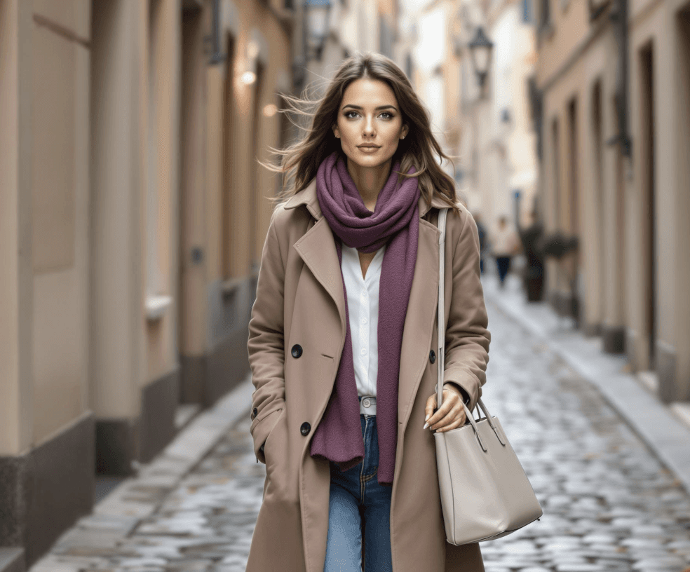
Neutrals | Cool gray, charcoal, soft white, light navy |
Reds | Cranberry, wine, rosewood |
Yellows (Rare) | Icy lemon, pastel yellow (only very cool, muted tones) |
These colors enhance your cool-toned features and maintain the softness that defines the Cool Summer look.
Colors Cool Summers Should Avoid
Cool Summers should avoid anything too warm, bright, or golden, which creates disharmony with their soft and cool coloring.
Color to Avoid | Why It Doesn’t Work |
|---|---|
Warm yellows | Too golden, clashes with cool skin undertones |
Orange tones | Overwhelms and creates an artificial look |
Earthy browns | Too warm and heavy |
Bright black | Too harsh and draining for your muted palette |
Neon or vivid hues | Overpowering and not aligned with soft coloring |
Makeup Tips for Cool Summer Using Color Analysis
Makeup is one of the fastest ways to apply color analysis and instantly see its impact. By choosing makeup shades from your Cool Summer palette, you create a seamless and harmonious look.
Makeup Category | Recommended Shades for Cool Summer |
|---|---|
Foundation | Cool or neutral beige with pink undertones |
Blush | Rose, cool pink, soft plum |
Lipstick | Icy pink, raspberry, berry, rosewood |
Eyeshadow | Soft gray, cool mauve, lavender, muted navy |
Eyeliner | Charcoal, navy, cool taupe |
Avoid bronzers or warm contour shades. Instead, use subtle, cool-toned products that enhance your natural flush and definition.
Building a Cool Summer Wardrobe: Practical Tips
Now that you know your ideal palette from color analysis, here’s how to use it in your closet:
Start with Neutrals: Base your wardrobe around soft white, slate gray, and dusty navy.
Layer with Color: Add accents like lavender sweaters, icy pink blouses, or muted green scarves.
Avoid Loud Prints: Stick with soft patterns or delicate florals in cool hues.
Choose the Right Jewelry: Silver, white gold, and pearls complement Cool Summer tones far better than gold.
Cool Summer Capsule Wardrobe Example
Category | Piece Example | Recommended Color |
|---|---|---|
Tops | Linen blouse | Powder blue or icy pink |
Bottoms | Tailored trousers | Slate gray or soft navy |
Outerwear | Trench coat | Cool beige or dove gray |
Dresses | Soft jersey dress | Lavender or raspberry |
Accessories | Silk scarf | Mauve or mint |
Final Thoughts: Why Color Analysis Works for Cool Summer
Color analysis isn’t just a trend—it’s a timeless framework rooted in aesthetics and psychology. For Cool Summer types, embracing soft, cool, and muted shades brings out your elegance, balance, and natural beauty.
By understanding your Cool Summer palette, you remove guesswork from styling and gain clarity and confidence in your personal aesthetic. It’s not about following strict rules—it’s about harmonizing with your natural design.